


PT - BR
Luciney Rebelo é uma nutricionista, que oferece atendimento clínico voltado para linha funcional integrativa, com foco em pessoas especiais com TEA, TDAH e T21.
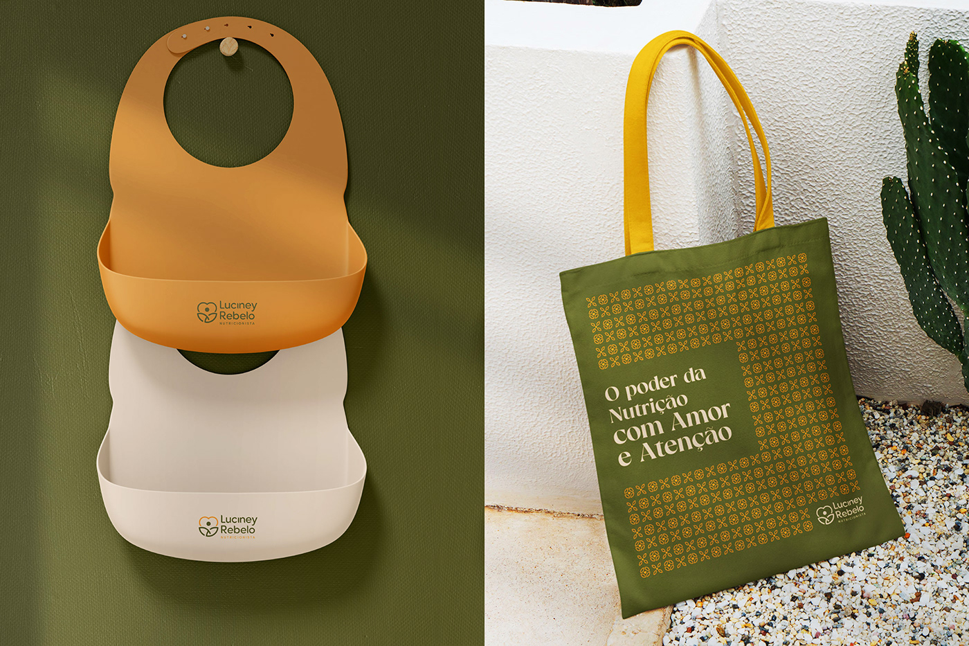
A ideia básica de conceito para essa marca foi dar ênfase à Atenção, Cuidado e Amor, que esses pacientes demandam, para uma alimentação saudável e a consequente melhora de sua qualidade de vida.
Seu símbolo foi criado através da junção de formas (Coração, Asas e Anjos).
O coração é o símbolo do amor, representa a força, a verdade, a justiça, a sabedoria, o espírito, o nascimento e a regeneração.
As asas simbolizam a espiritualidade, a libertação da alma, o alçar voo.
O coração + asas, simboliza o amor de Deus, o centro espiritual e emocional dos seres.
Os anjos, são a pureza, fazem parte daquilo que poderia ser chamado de exército de Deus. No caso da Luciney, os Anjos remetem aos seus pacientes.
A formação do símbolo representa o cuidado e carinho, tendo um ponto como centro, dando a ideia de total atenção ao paciente vendo-o como um todo e seguindo a ideia base da Nutrição Integrativa.
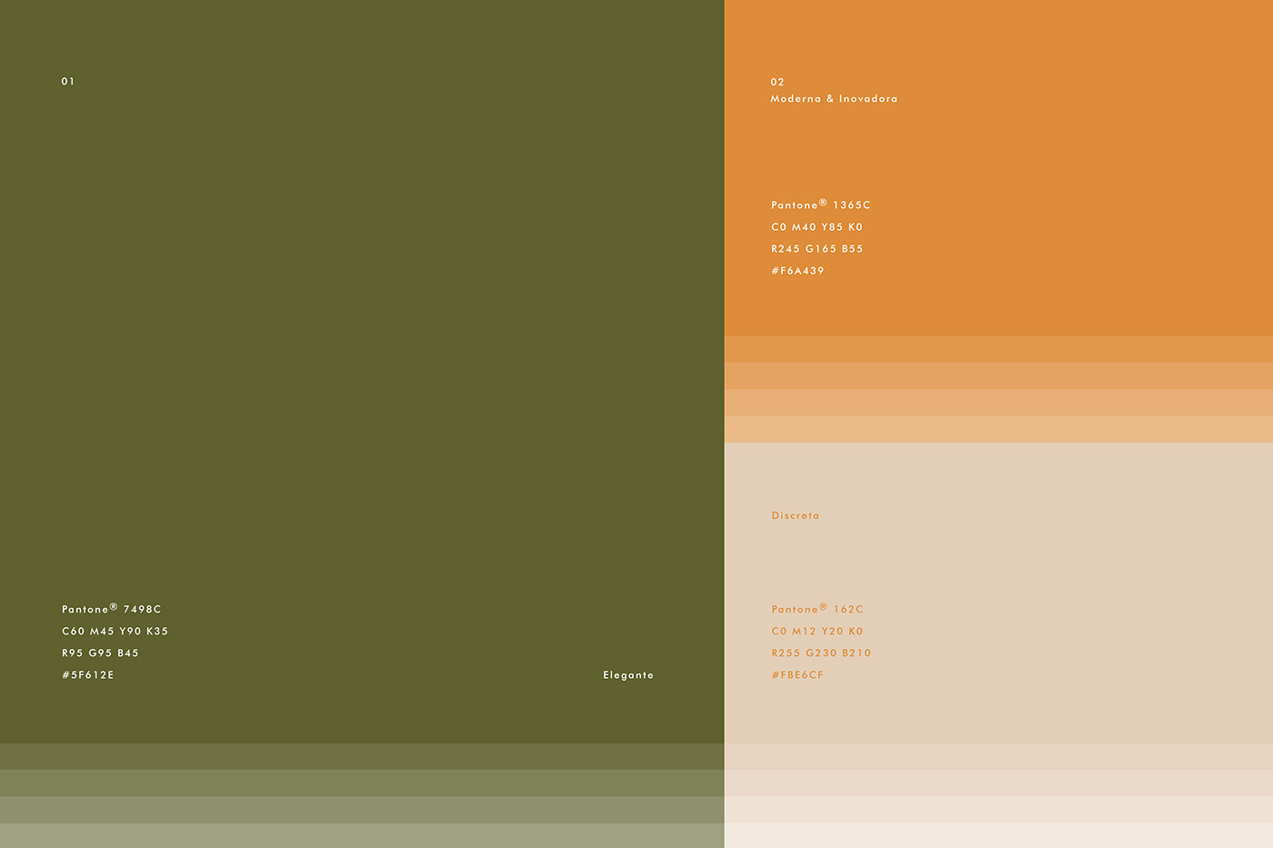
Quanto às cores, foram escolhidas: verde, amarelo (mostarda) e bege.
O verde é a cor da saúde, do frescor e simboliza os vegetais, a vida e é a cor da nutrição, já a cor mostarda traz doçura, aconchego e significa confiar permanentemente no Senhor, pois devemos ter fé do tamanho de um grão de mostarda independentemente das circunstâncias, além dela representar uma especiaria dentro da nutrição. O Bege é uma cor que transmite calma, neutralidade e é considerada uma cor clássica.
Assim, criamos um conceito com embasamento forte e que traduz o serviço e o sentimento de cuidado que a nutricionista Luciney Rebelo oferece aos seus anjos.
------------------------
EN
Luciney Rebelo is a nutritionist, who offers clinical care focused on integrative functional line, focusing on special people with ASD, ADHD and T21.
The basic concept idea for this brand was to emphasize the Attention, Care and Love that these patients demand for healthy eating and the consequent improvement in their quality of life.
Its symbol was created by joining shapes (Heart, Wings and Angels).
The heart is the symbol of love, it represents strength, truth, justice, wisdom, spirit, birth and regeneration.
The wings symbolize spirituality, the liberation of the soul, the flight.
The heart + wings, symbolizes the love of God, the spiritual and emotional center of beings.
The angels, they are the purity, they are part of what could be called the army of God. In Luciney's case, the Angels refer to their patients.
The formation of the symbol represents care and affection, having a point as the center, giving the idea of total attention to the patient, seeing him as a whole and following the basic idea of Integrative Nutrition.
As for the colors, they were chosen: green, yellow (mustard) and beige.
Green is the color of health, freshness and symbolizes vegetables, life and is the color of nutrition, while mustard color brings sweetness, warmth and means permanently trusting in the Lord, because we must have faith the size of a mustard seed regardless of the circumstances, besides it represents a spice within nutrition. Beige is a color that conveys calm, neutrality and is considered a classic color.
Thus, we created a concept with a strong foundation that translates the service and feeling of care that nutritionist Luciney Rebelo offers to her angels.
Follow Me: @salgado.felipe
Client: Luciney Rebelo | Service: Visual Identity | Year: 2023 | Brand Designer: Felipe Salgado


Would you like a similar project?
Contact me → felipesalg@gmail.com
Follow me → @salgado.felipe
Website → www.felipesalgado.com.br
Contact me → felipesalg@gmail.com
Follow me → @salgado.felipe
Website → www.felipesalgado.com.br
Felipe Salgado © • All Rights Reserved


